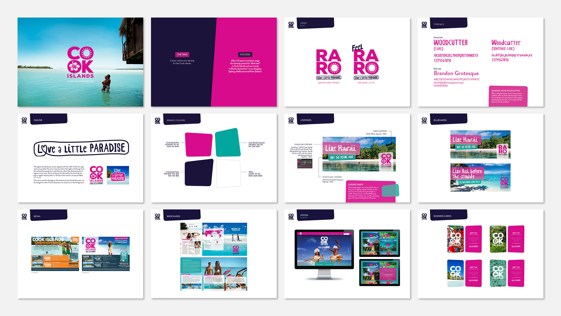
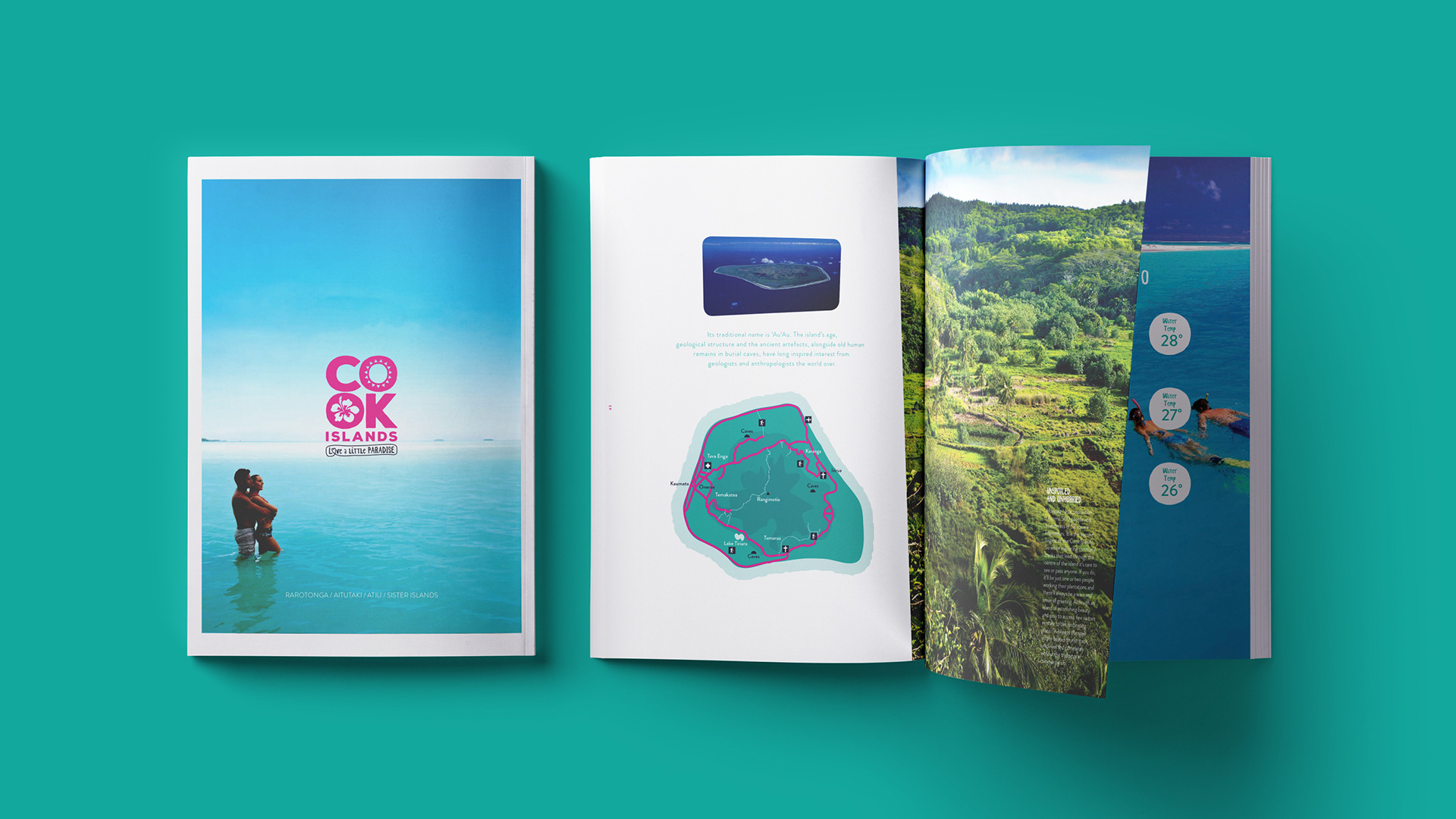
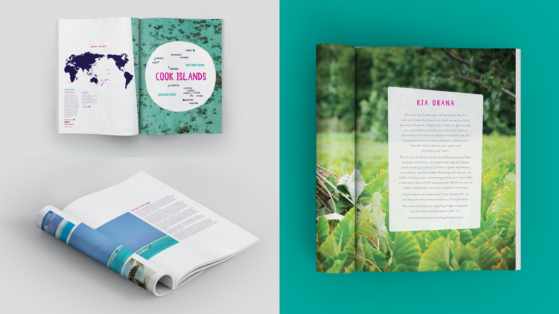
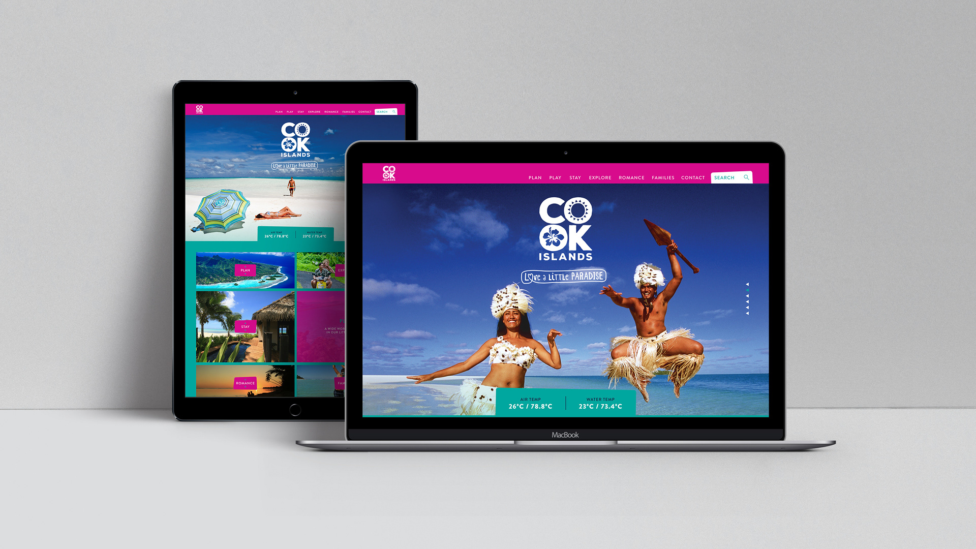
Complete rebrand created for Cook Islands Tourism. Logo, brand book, all media collateral. The client felt their brand was dated and needed to appeal to a wider audience while still capturing the spirit of the people and the essence of the islands. I was lucky enough to work onsite for this project and experienced first hand the warm nature of the locals.
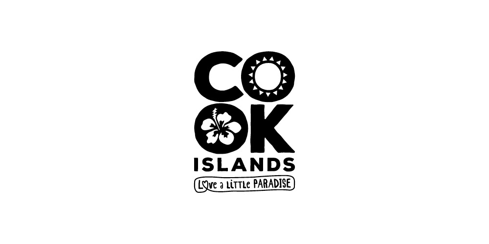
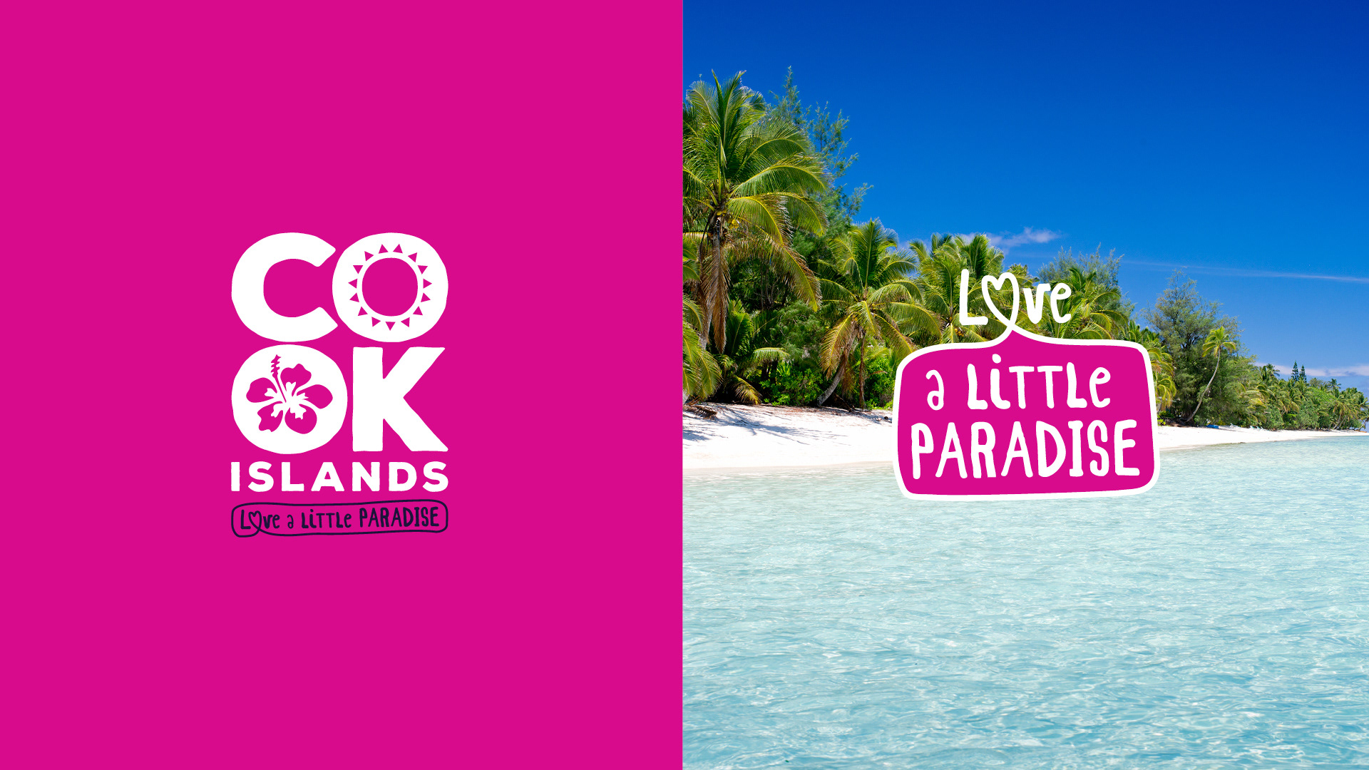
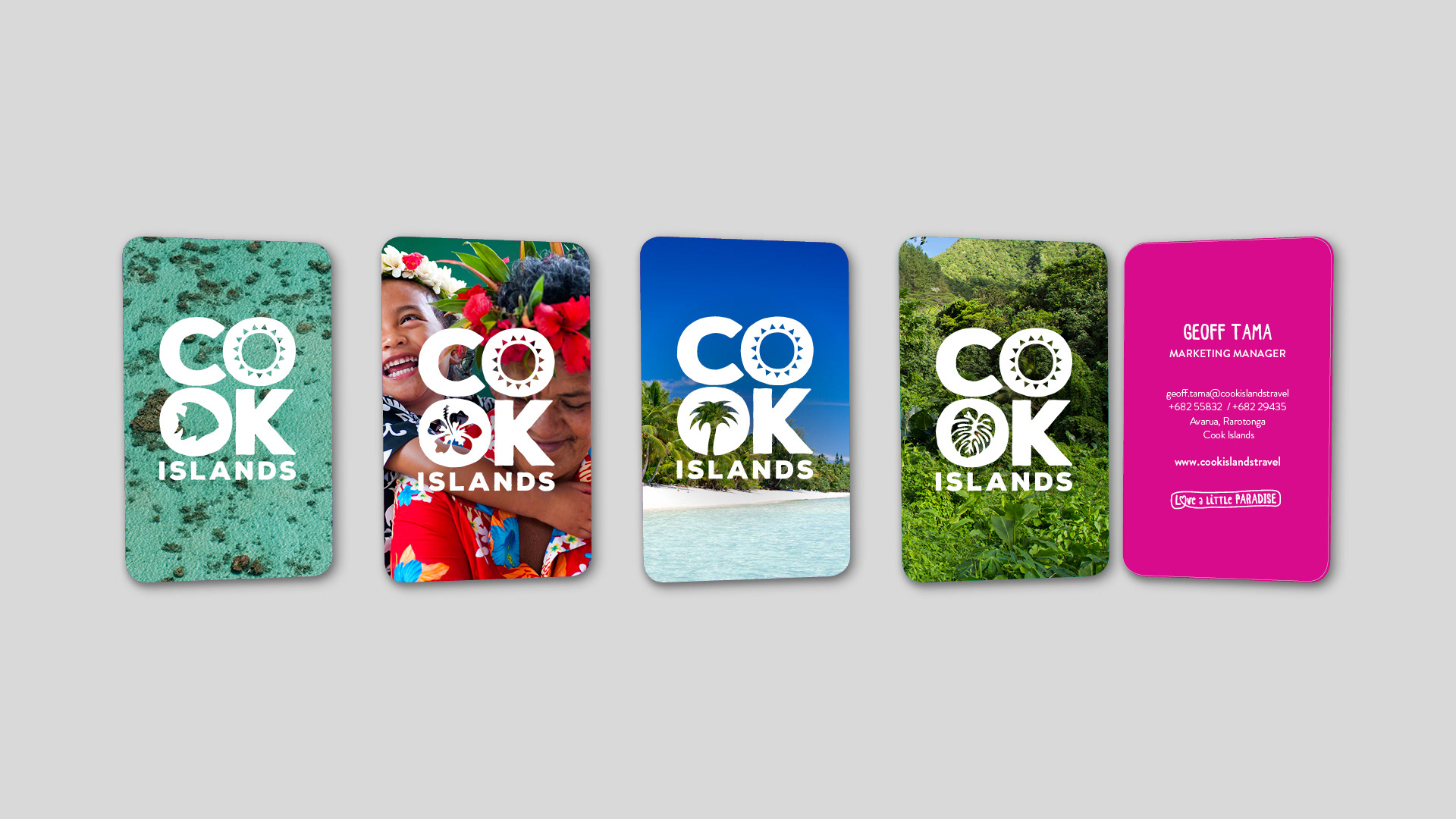
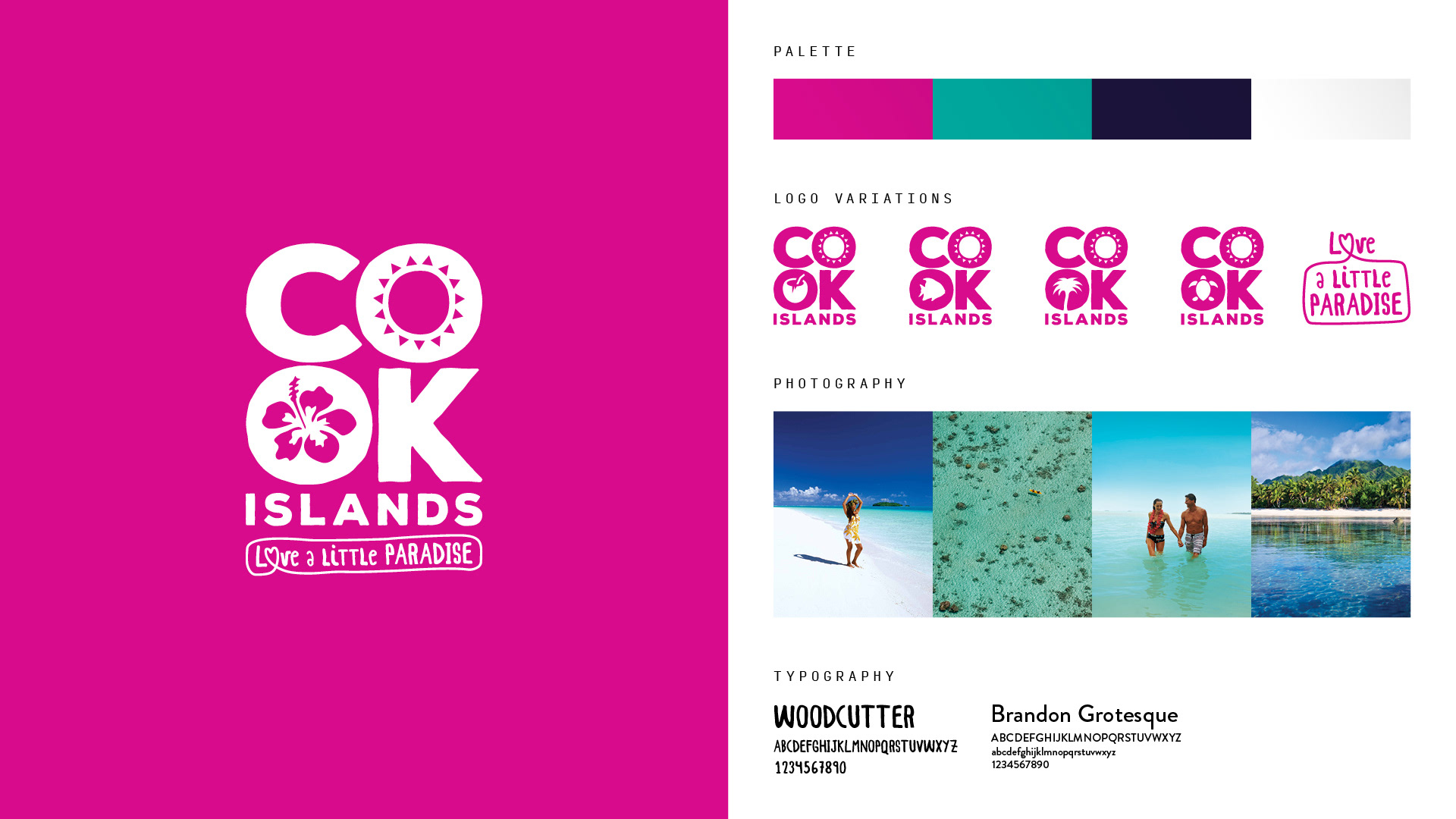
The colour pink and bold typography matched perfectly to the energy of the people and worked harmoniously with the turquoise hues of the lagoons in all campaign imagery. A range of dynamic logos were created, with different icons used to knock out the bottom 'O', with the sun always shining in the top one.
The sun is made up of 15 rays, symbolising each of the islands in the country. Identity and Brand Guidelines created. The brand has been worn proudly by the tourism board and locals alike since the rebrand.

BRAND ELEMENTS
BRAND GUIDELINES