Brand design for elemental. Home to natural health products and supplements, they are a modern store and stand for wellbeing. The brands they display in store are essentially derived from natural elements, so I wanted to highlight the science behind the name “elemental”.
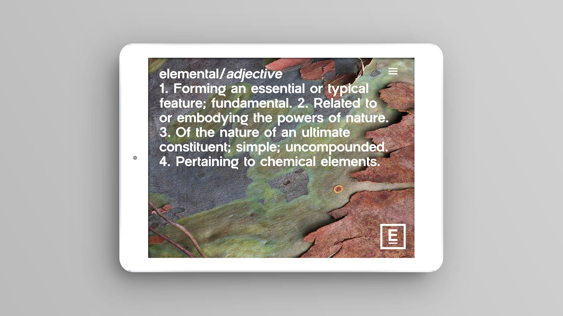
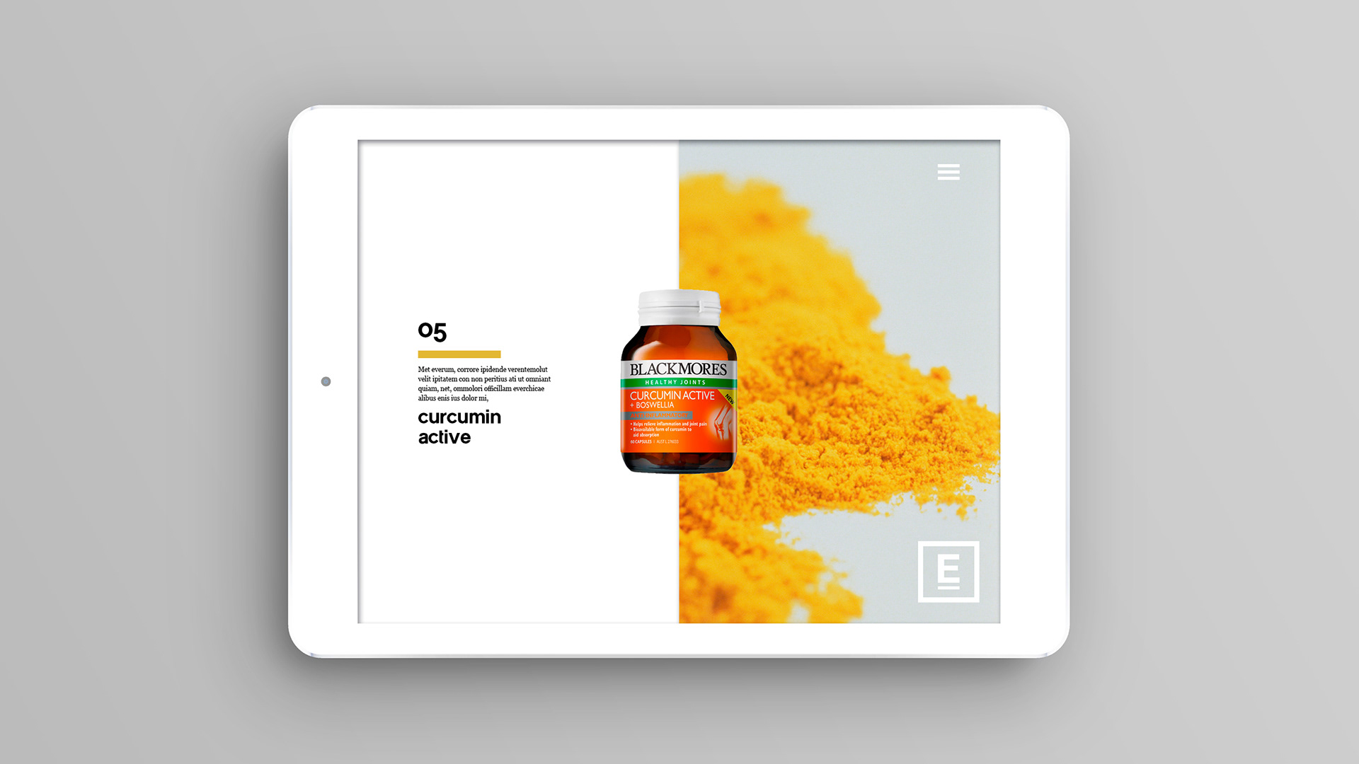
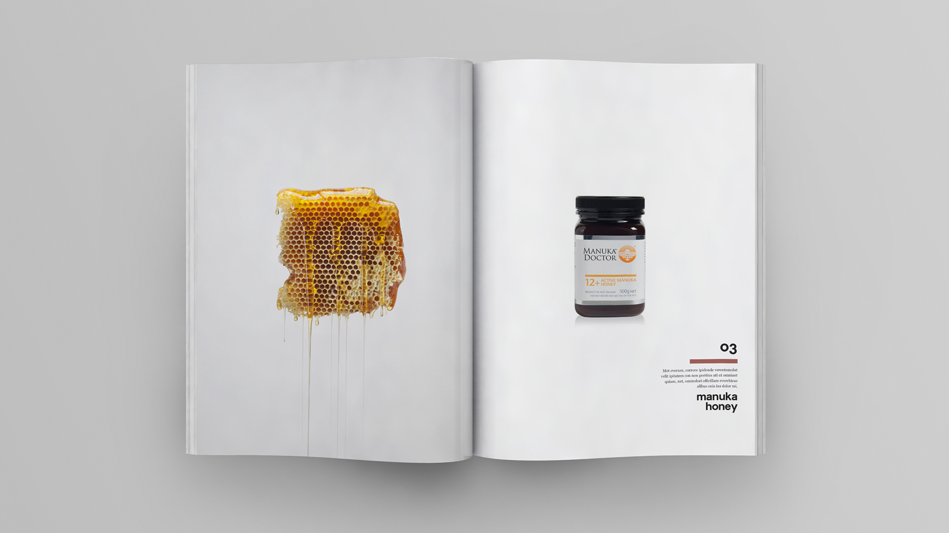
Using the periodical table and natural tones and hues, I wanted to create a sophisticated and high end aesthetic, avoiding being too medical and sterile. As an Australian based brand the gum tree was the basis of my colour palette. Cool greys, muted greens and soft brown tones translate into a harmonious tonal range. The use of simple, beautiful images intertwining with the brandmark helps create an array of interesting visuals. Bronze embossing has been used sparingly on packaging, indicative of the natural brown tones used in the master palette.
This project was a concept design.


BRAND ELEMENTS
